-
Architects: March Studio
- Area: 70 m²
- Year: 2014
-
Photographs:Peter Bennetts

Text description provided by the architects. The way in which we shop has changed dramatically over the past few years. Yet as High Street shopping is replaced with the convenience of the online store, the experience of touching, trying, and smelling an object will never be replaced. Whilst some of the larger chains are struggling to implement web based change, the new Sneakerboy concept store is taking it to another level.

The first of many to be rolled out, Sneakerboy Melbourne is at the cusp of this retail revolution. It is an online store you can walk in to; there is no stock, no cash, no till, and no product to take home. All that is needed to make a purchase in the store is a smart phone, (or one of the in-store Ipads) and a Sneakerboy ID. The rest of the available space is dedicated to the range of shoes, which means Sneakerboy can boast a larger range of stock on a much smaller footprint.

The architecture and the branding of the store, (also designed at March Studio), follows this underlying business structure, and yet also brings the digital connectivity to the forefront.

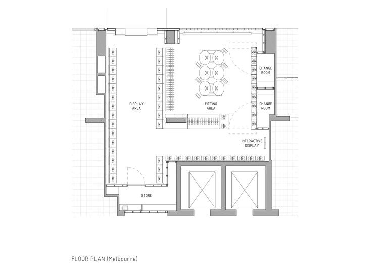
Sneakerboy Melbourne consists of two main areas; the display area and the fitting room. These two areas are expressed in the façade, a large circular steel portal directs the customer to the entrance and into the viewing chamber, whilst obscure glass blocks create a private, fitting room bathed in natural light.

The display area is designed with the same retro futurism of an Underground station, a reference to the sneaker’s rise to fashion in New York’s transport strike of 1966. Illuminated curved glass shelves house the entire range of sneakers, a viewing canvas for 162 individual shoes, which can be dimmed and adjusted by changing the lighting. Scrolling LED tickers under each sneaker display the shoe’s designer.

Customers are invited to scan the product with the Sneakerboy App for pricing and sizing, and the LED’s, a portal into the online store, can react and respond to online activity, displaying comments like “Just bought in Shanghai” or “Sold out”. 1200 metres of cabling, reminiscent of a server room, is le exposed through the glass shelves rather than hidden away, a reminder of the hard wired nature of technology and connectivity.

Customers are invited into the fitting room to check sizing and to make purchases. Constructed from 300 blackened steel pigeon holes, the fitting room is conceived as a library, housing all sizes of all styles. 6 custom spun steel chairs with integrated Ipad holders anchor the room and give the customers the opportunity to browse online and purchase whilst trying on.


